Little problem on iPad with full site
Hi,
On iPad (and maybe other tablets, with larger screens than smartphones) browsing the full site can be more attractive than browsing the mobile version.
And everything seem to be OK with the full site on iPad...
Excepted one little thing:
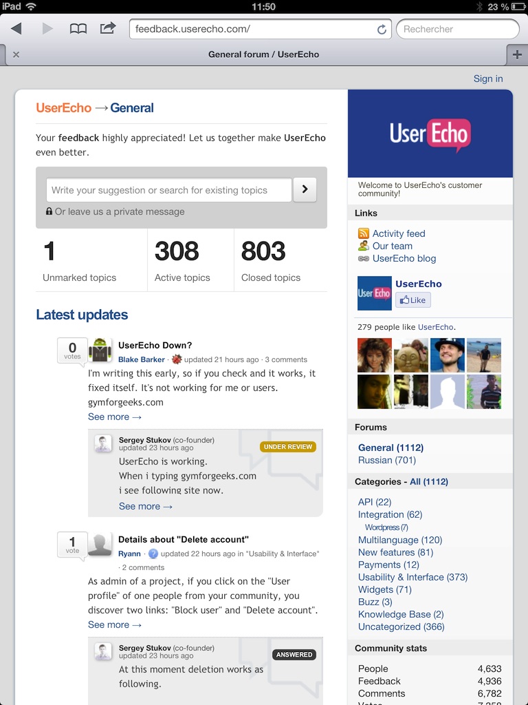
- the "votes counter, icon and author" summary is perfect on the topic list (see first following snapshot)
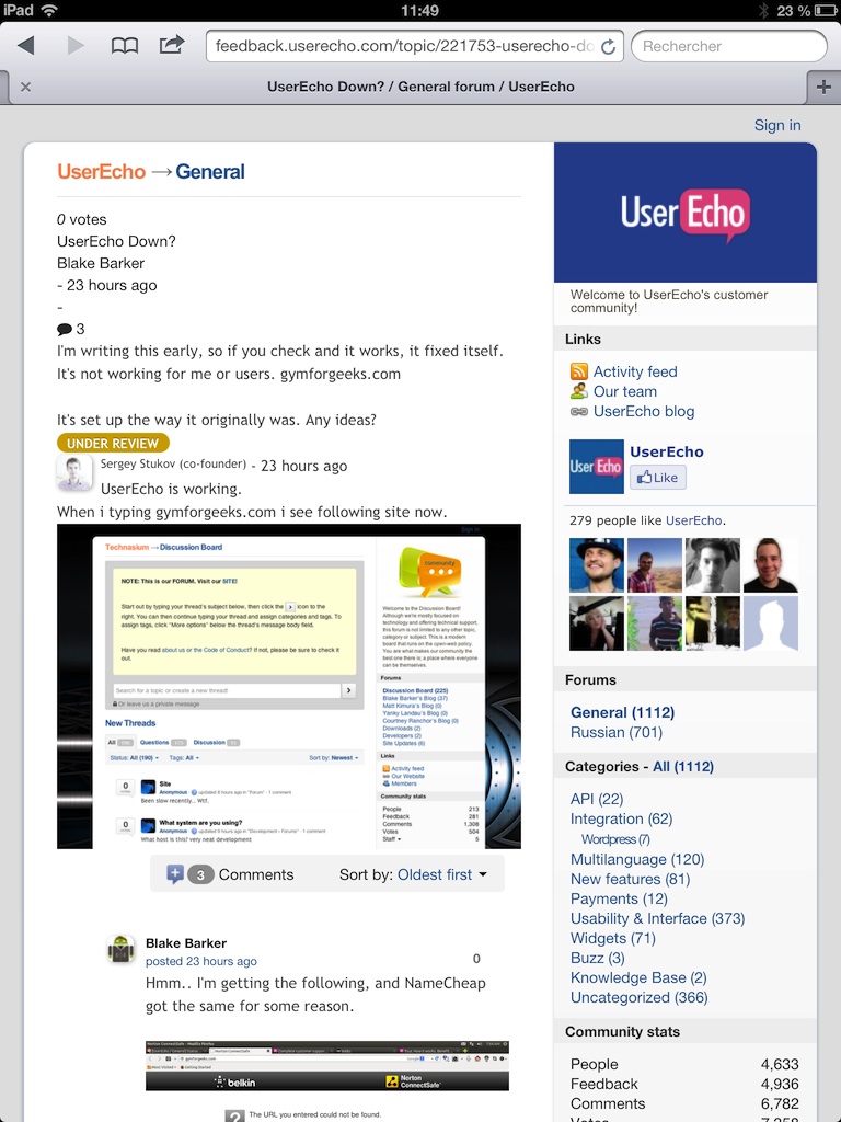
- but the same informations are broken if you go into the topic details (see second following snapshot).
Maybe the HTML code for the two identical layouts are not really identical?
Best regards.
First snapshot (topic list: OK)

Second snapshot (topic detail: NOT OK)

How would you rate the customer service you received?
Satisfaction mark by Ryann 10 years ago
Add a comment about quality of support you received (optional):


Hello,
It seems to me that now, the topic detail page does not present this problem any more.
It must have been corrected thanks to the continuous evolution of UserEcho.
The issue can be closed.