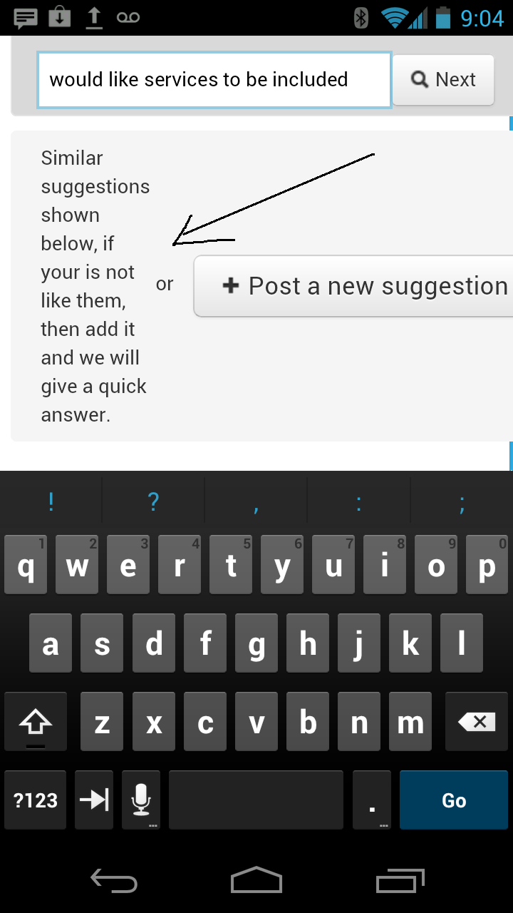
Android format needs fixing when posting a suggestion

Avatar
  • updated
  • Fixed

When we are posting a suggestion using Android the format of the response after the initial lookup is not intuitive, especially on smaller screens.  The initial response needs to appear above the "Post a suggestion button" not to the side which it currently does not, not sure whether this is a bug but I have posted under bugs because it is not a suggestion.  I have a screenshot but I cannot seem to attach this to this post many thanks.


Pinned replies
Avatar
Sergey Stukov co-founder
  • Answer
  • Fixed

We have applied some interface improvements for android check how it look now.


Before                                                Now 


Avatar
Sergey Stukov co-founder
  • Answer
  • Fixed

We have applied some interface improvements for android check how it look now.


Before                                                Now 


Avatar
Sergey Stukov co-founder
  • Planned

Can you send screenshot to the info@userecho.com?

Avatar
Sean D.

Hi Sergey, any idea for a fix for this?  We soon want to give our Android users access to Userecho but need that formatting sorted, is this possible to have this done soon?


Avatar
Sergey Stukov co-founder
  • Under review

Can you send screenshot to the info@userecho.com?