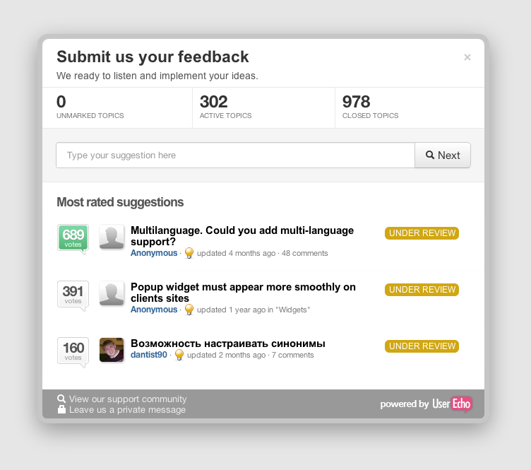
Widget popup UI design
The design of your forum webpages is clean, professional and consistent. Unfortunately, I cannot say the same for your popups. It seems they were designed by a completely different person, with different color schemes and fonts etc.
The widget popup is the first (and possibly only) interaction point a user has with the company's support system so it is critically important that it presents a great user experience. An amateurish-looking popup reflects badly on the company - your customers.
Lucky for you, your main competitors like GS and UV don't seem to have put much effort into their popup UI design as well so IMO this is an easy way for you to stand out by offering a great user experience at the first point of contact with the user.


