"After search text" should be hidden if no result found

Avatar
  • updated
  • Planned
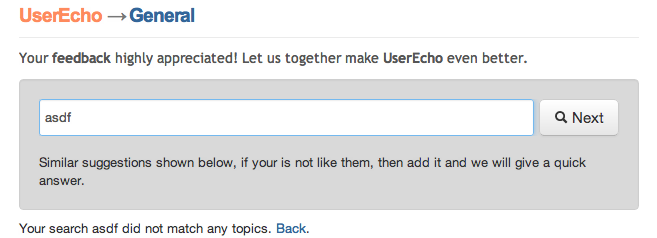
Otherwise you'll see contradictory messages: the "After search text" will say "Similar suggestion shown below", but right below it, another message says "Your search <search term> did not match any topics".

Btw "topics" is wrong. Since there's no match, it should be a singular "topic".
Pinned replies
Avatar
Sergey Stukov co-founder
  • Answer
  • Planned
Thanks, we reopened topic and will make updates soon.
Avatar
Sergey Stukov co-founder
  • Answer
  • Planned
Thanks, we reopened topic and will make updates soon.
Avatar
Cheehan Tee
Quote from Sergey Stukov

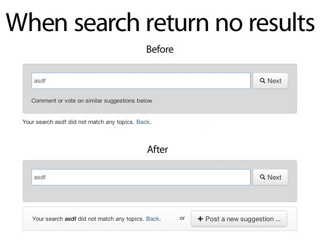
  1. Removed contradictory messages
  2. Search completed notification message in more visible now
  3. Search query highlighted with bold style
  4. Added button that calling to action

Any suggestions and feedback appreciated. 

I also want to suggest that you make the search status - i.e. whether any topic match was found more obvious. Perhaps use a different color that stands out. 
Also it should probably be visually linked to the search input box. Right now they are in separate bounding boxes, as if they are unconnected when in fact one is a result of typing in the other. So perhaps put them in the same bounding box and combine the two buttons into one (see my previous post).
I feel the "back" link is unnecessary. Why would a user want to go back to the generic page after entering a topic? And if he really wants to, he can always use the browser back button. So this is unnecessary clutter.
Avatar
Cheehan Tee
Quote from Sergey Stukov

  1. Removed contradictory messages
  2. Search completed notification message in more visible now
  3. Search query highlighted with bold style
  4. Added button that calling to action

Any suggestions and feedback appreciated. 

Two problems with this. 
(1) The "Post a new suggestion" button does the exact same thing as "Next". Giving an unnecessary choice creates unnecessary confusion for the user who will be wondering "which one should I click?". Perhaps you can replace the "Next" button with the "+Post" button once a search has been made.
(2) The words "Post a new suggestion" is too specific and therefore frequently wrong. E.g. the user could be posting a question, or bug or compliment and will be wondering why suddenly he's forced to post a "suggestion". It is also inconsistent with the next screen which says "Submit new feedback".
Avatar
Sergey Stukov co-founder
  • Fixed
Thanks, will update ASAP.
Also search query text in message will be marked (bold)
Avatar
Sergey Stukov co-founder

  1. Removed contradictory messages
  2. Search completed notification message in more visible now
  3. Search query highlighted with bold style
  4. Added button that calling to action

Any suggestions and feedback appreciated. 

Avatar
Sergey Stukov co-founder
  • Started
Thanks, will update ASAP.
Also search query text in message will be marked (bold)
Avatar
Cheehan Tee
Btw, I might be wrong wrong about the singular "topic" comment. Please ignore it (I couldn't edit my post)
Avatar
Cheehan Tee
Here's a screen shot of the contradictory message.