Too long strings for menus in iPhone web version

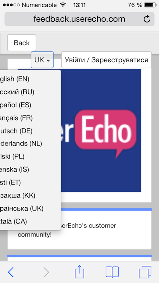
As visible on the above image of the "right panel" of the userecho welcome screen, some language translations may have too long strings implying:
- a placement of buttons not very beautiful (not on the same line, and overlapping the page)
- a part of the menu hidden outside the screen
I suggest the best way would be to use small icons instead of texts (like in "main panel" of the welcome screen).
- "Back" could be replaced with the usual icon : "<"
- "Sign in/Sign up" could be replaced by an icon like the outline of a person : like this
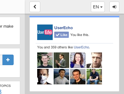
How would you rate the customer service you received?
Satisfaction mark by Ryann 12 years ago
Simply great! (and fast)
Add a comment about quality of support you received (optional):