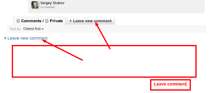
Show comment form at once instead two links to it


I agree this is confusing for users. However I can see why it is like this. When new comments will be added, the bottom link gets pushed down.
Ok seems that replacing bottom link with textarea and top link will do focus on textarea, will be better and allow to avoid 1 unneeded mouse click in some cases.
I agree this is confusing for users. However I can see why it is like this. When new comments will be added, the bottom link gets pushed down.