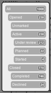
Clarify status filters for user
The ability to filter items by status is really important. You have the capability http://screencast.com/t/cEwllqJsH ! But I have a suggestion to improve the usability.
If the options in the list were in a visual hierarchy and you said "open" rather than "opened" I think it would be a much quicker job to comprehend.
All
Open (13) (every ticket was open*ed* at some point)
Active (2)
Unmarked (5)
Under review (4)
Planned (1)
Started
Closed (6)
Completed (6)
Declined


Good suggestion, yes it more logical to show filter list with existing hierarchy.
Will consider to implement it soon.