strange margins in topics list
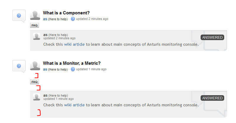
These are two identical questions in generic topics list. Why 2nd one has bigger margins?


"We thinking about remove that link.
And add following action. When user hover mouse cursor over status badge, it will see tooltip, click on status to see status updates history."
Yeah, you can just move the same stuff below the top line (center or right corner). Surely you need not to reserve space for it.

First one it's
<p></br></p>
inside blank topic description body, we improve cleanup preprocessor for such cases
2nd is place where appears link to display status updates history.
We thinking about remove that link.
And add following action. When user hover mouse cursor over status badge, it will see tooltip, click on status to see status updates history.

First one it's
inside blank topic description body, we improve cleanup preprocessor for such cases
2nd is place where appears link to display status updates history.
We thinking about remove that link.
And add following action. When user hover mouse cursor over status badge, it will see tooltip, click on status to see status updates history.