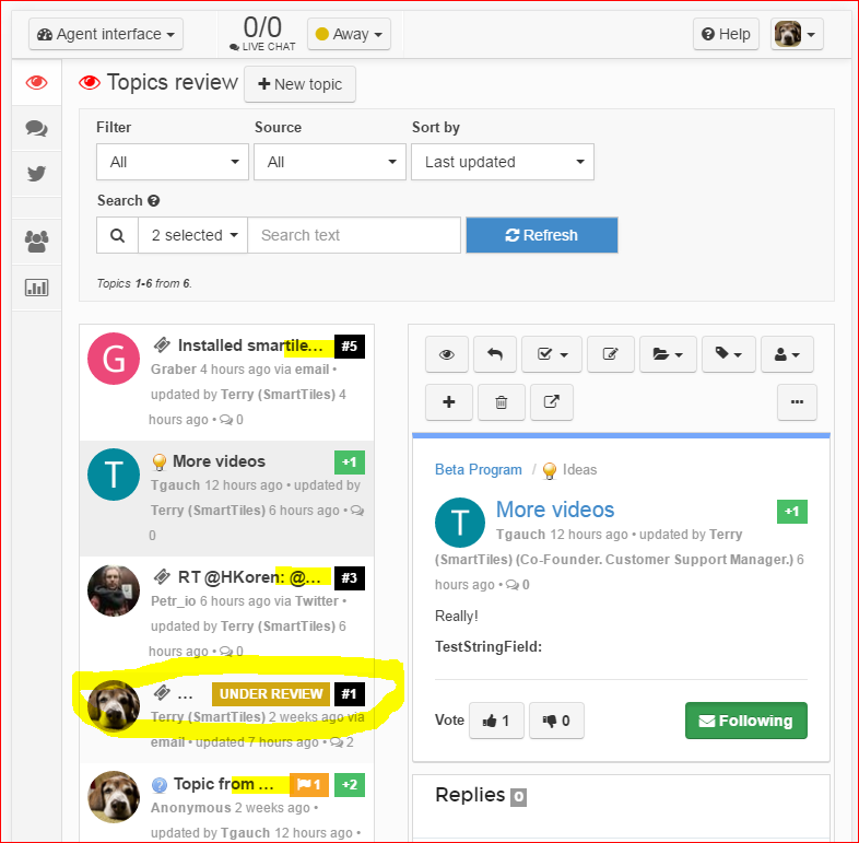
Agent Interface view truncates Topic Titles
I'm new to UserEcho but presume that I will be using the Agent Interface view very frequently, including from my Nexus 9 Tablet or iPad.
The two column layout (list of Topics on left, Details of selected Topic on right), is sub-optimal on tablet screens (even on smaller width desktop screens), as Topic Titles are truncated instead of wrapping.
This is particularly an issue due to the other display items that share the same line as the Topic Title (i.e., moderation flag, status phrase [sometimes quite long like "UNDER REVIEW"], vote count, and ticket number).
As shown in attached screen capture, please see yellow highlight markings, this often results in completely useless Titles (even just "...").

I recommend one or more of the following options be made available, please:
- Wrap Topic Titles instead of truncating, even if it makes the Topic List pane less compact.
- Offer smaller font choices (+ Title wrap) to help make titles fit and help keep Topic List compact.
- Offer a stacked preview mode instead of side-by-side (i.e., resizable Topic List pane on top of Topic Detail pane).
- If necessary: Allow user to force "narrow mobile screen mode" (i.e., single pane view that is used on narrow devices like phones, where List and Details are separate screens).


Hello Terry,
Thank you for your report.
We've made some optimizations for a mobile phone and Agent interface looks not bad now. Will do some optimizations for a tablet soon.